Greenlink Analytics
LEVERAGING DATA TO CREATE A MORE EQUITABLE FUTURE
WHAT WE DID
Our team worked closely with the data, energy, and equity experts at Greenlink Analytics to create a web application that allows users to visualize equity-related issues and understand how burdens are spread across communities.
Consulting & Strategy
UX & UI Design
Data Analytics & Visualization
Web App Development
DevOps
Ongoing Product Support & Improvements
About GEM
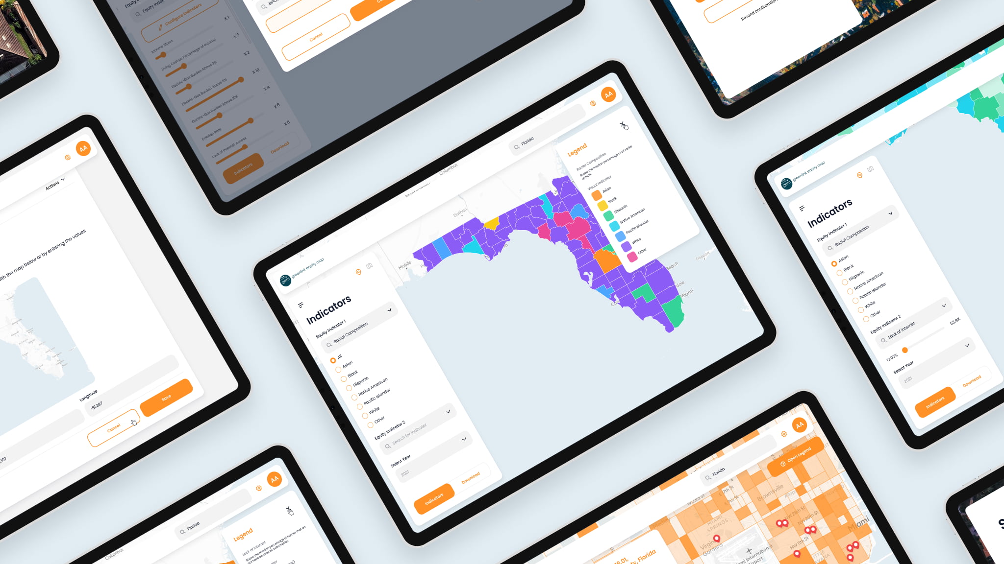
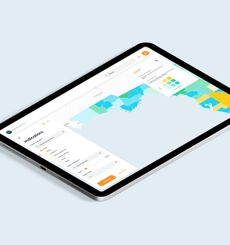
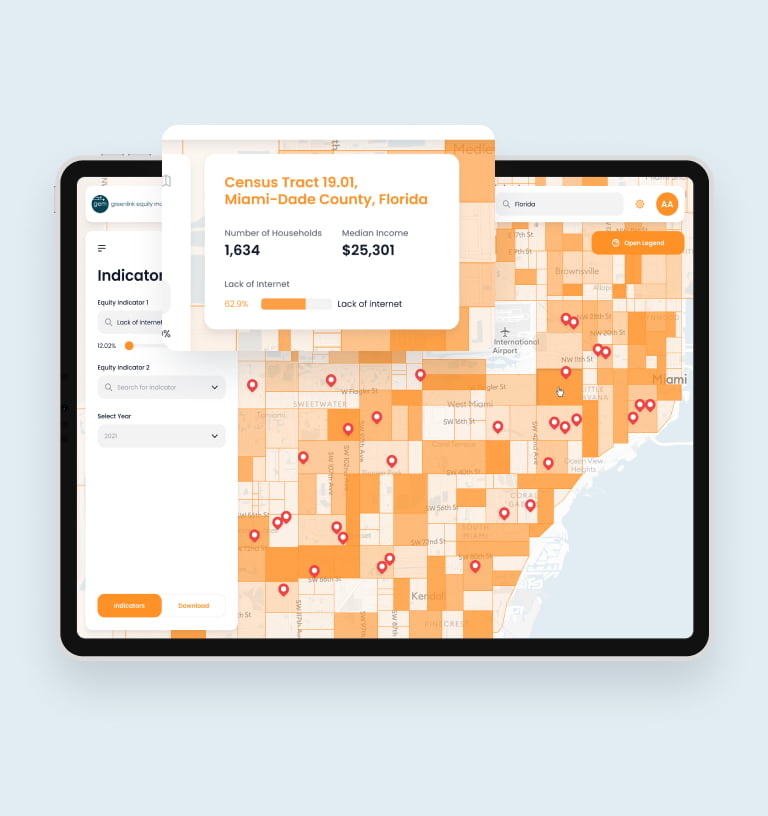
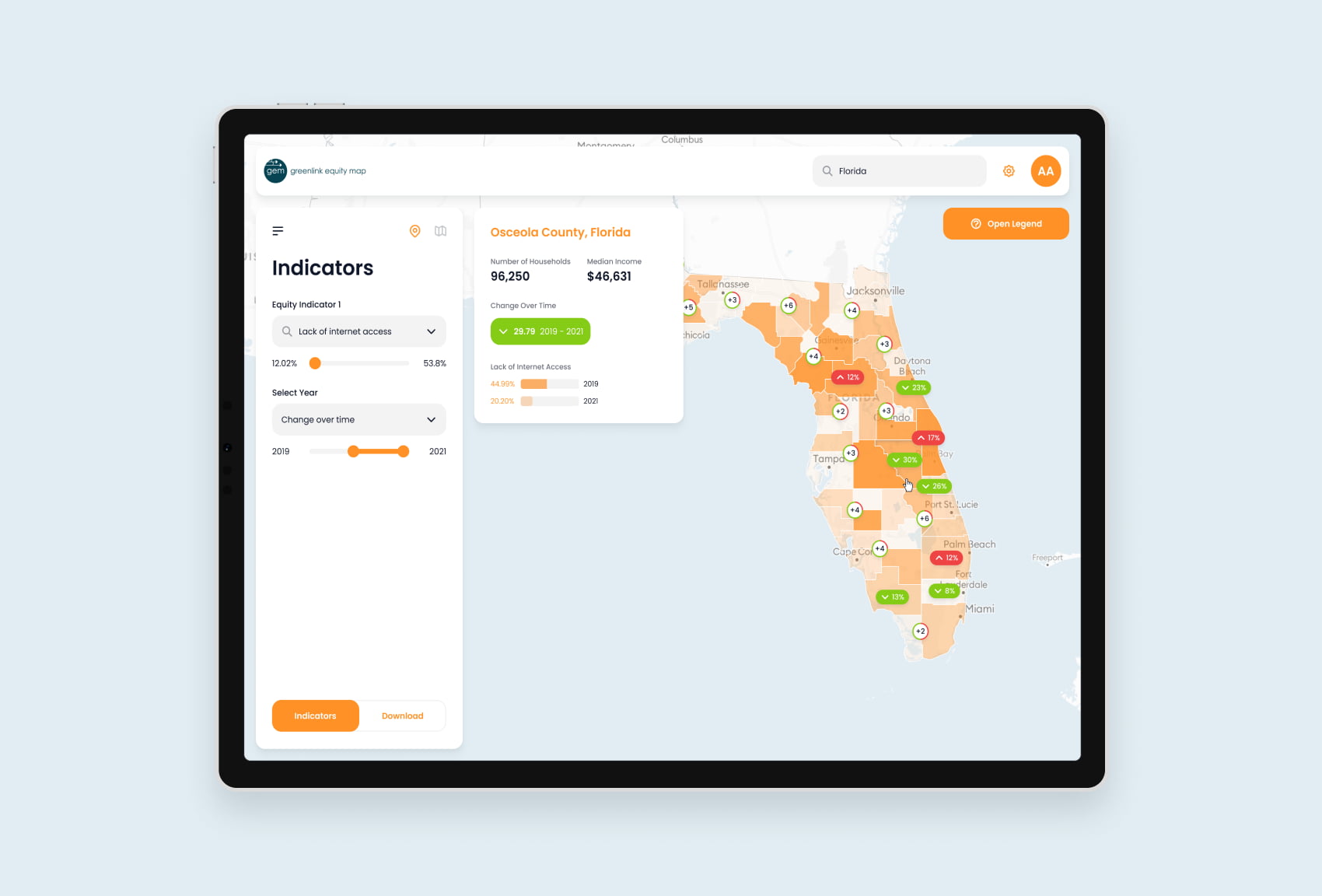
The Greenlink Equity Map (GEM) is a web app that drives change from the ground up, empowering decision makers at all levels to pursue initiatives armed with complex data analytics. Powerful map-based data visualizations allow users to highlight social and environmental disparities across neighborhoods, counties, and cities in order to create new laws and policies, support grant applications, define strategies to reduce CO2 emissions, and more.
Cities, states, organizations, and policy makers around the country are using GEM to transform their energy consumption, reduce their environmental footprint, and create change by addressing various equity disparities our communities are facing.
500+
Users
Hundreds of decision makers across the country use GEM to drive positive change in our communities.
150+
Organizations
Cities, states, NGOs, and more leverage GEM as a means of furthering impactful initiatives, legislature, and investments.
5 ★
Willingness to Refer
Success isn’t just about creating a product that works. It’s about building a partnership based on trust and a shared vision for the product.
35+
Equity Indicators
Ranging from internet access and utility burden to asthma rates and household income, GEM’s growing list of indicators makes the tool incredibly powerful.
Telling A Story
Designing and developing GEM presented a number of exciting challenges for our team. Most importantly, we had to figure out how to craft a user experience and interface that cleanly visualized complex data sets in a dynamic way that was also easy for users to understand.
Visualizing multiple data sets, particularly over a map, can be tricky and cause confusion for users. Given the importance of these equity and environmental indicators, we needed to make sure the data was telling the right story. Our UX/UI designers did extensive research and numerous iterations throughout our process in order to land on an experience that handled this important data with the care it deserves.
Cleaning the Data
Drawn from census data and other publicly available sources, GEM is working with huge data sets that span a number of years. Properly cleaning and formatting the data as well as optimizing the app for performance at scale required an in-depth effort and extensive tech infrastructure. In partnership with the data experts at Greenlink Analytics, our team focused on ensuring GEM’s indicator visualizations were powered by high-integrity data and technologies.
“Their responsiveness, communication, and calmness are impressive.”
Matt Cox, CEO, Greenlink Analytics